Our Hallway Makeover + How to Decorate a Hallway in 5 Steps!

Happy New Year! I don’t think I’ve ever been THIS happy to say those words. 2021, I greet you with open arms…and a newly made-over hallway! So excited to share pictures with you today of our hallway transformation with Curator Paints.
Shop
The Post


Our Hallway Makeover + How to Decorate a Hallway in 5 Steps!
You may remember we teamed up on several interior design projects with Curator last year:
1. Our front doors
2. My niece’s nursery
3. My best friend’s bachelorette pad
I was thrilled to team up on this project too because not only do I love Curator — the paint colors and the coverage are outstanding — but also because we’ve been wanting to gussy up our hallway for quite some time. The walls of the hallway had been an eggplant purple color before and while it was a fun departure, it just didn’t feel very “us” and didn’t really correlate to anything else in the house.
Three Areas of the Hallway
The hallway is quite long and there are three distinct areas to it:
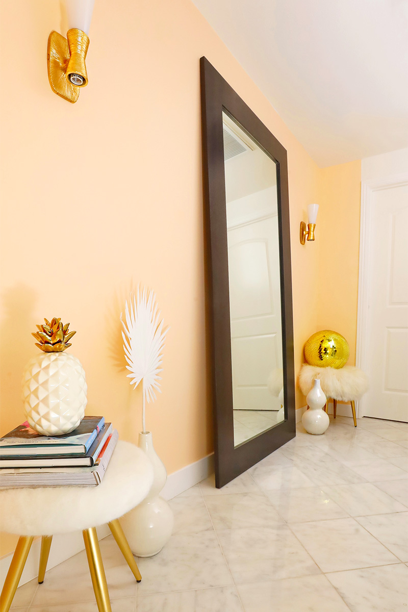
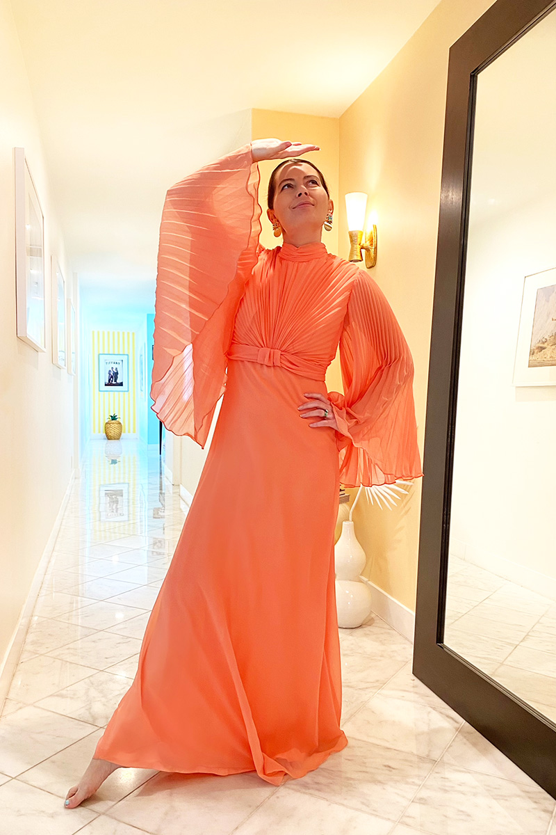
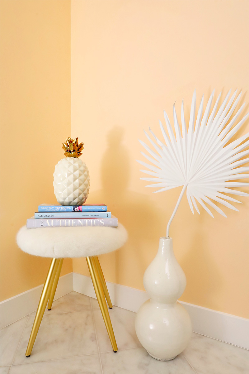
Area 1: The Entry Hallway
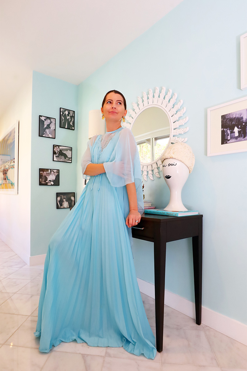
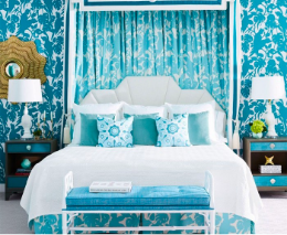
This is where you first enter the hallway from the main living areas of the house. It is visible from the aqua dining room, white & gold kitchen (more pics here) and white & gold living room and is located right next to our blue-and-white bedroom.
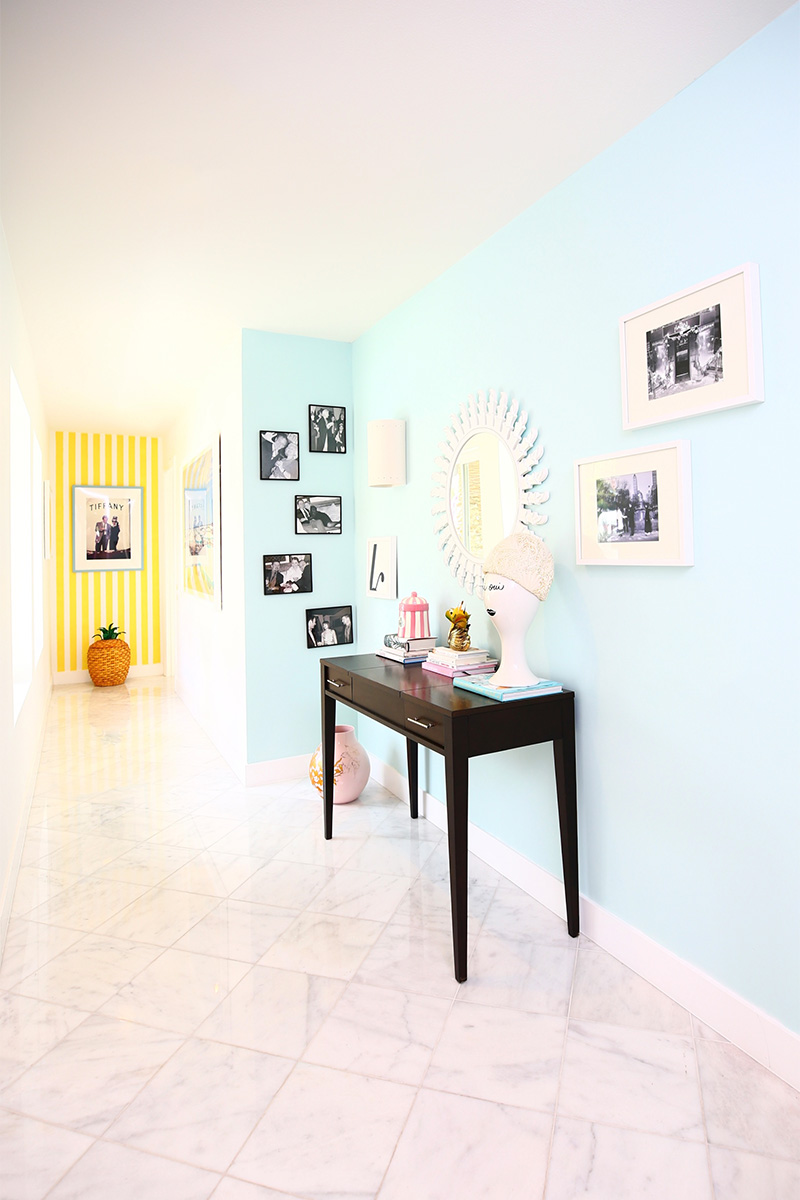
Area 2: The Mid-Hallway
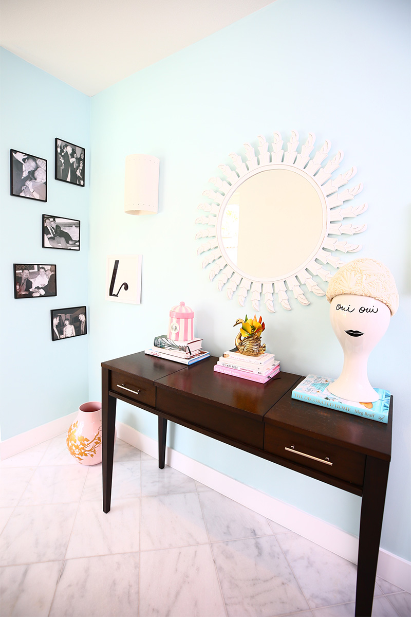
This area of the hallway is right outside of Fred Baby’s office and is the middle section of the hallway.
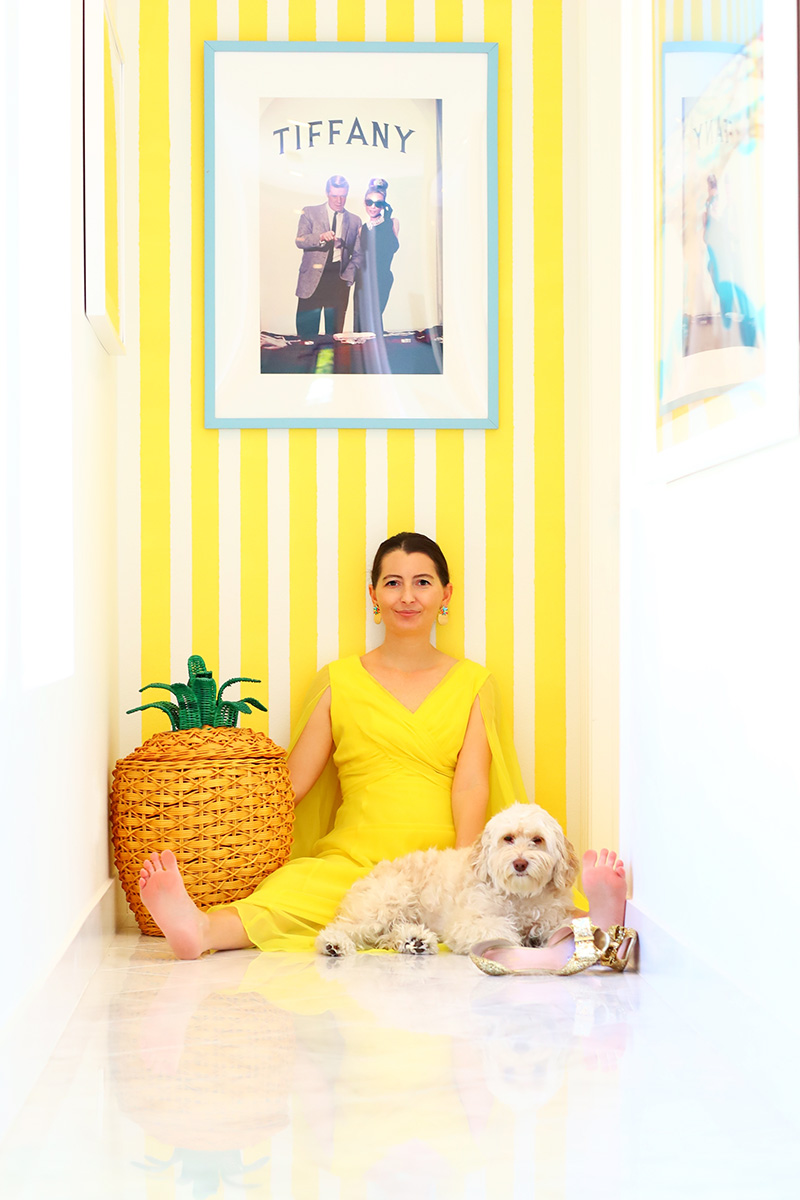
Area 3: The End of Hallway
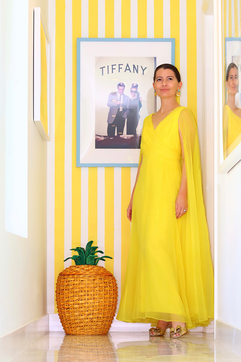
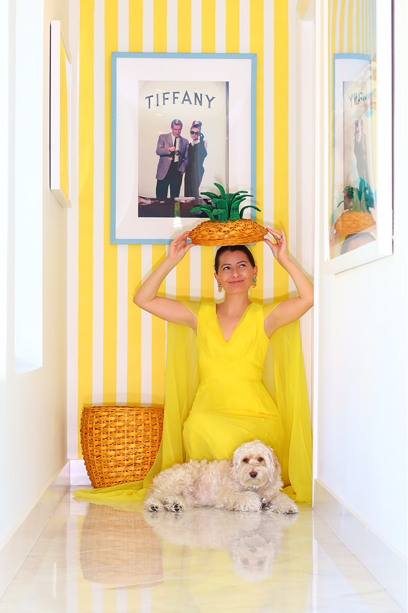
Fairly self-explanatory, but note this is the narrow end wall that is more vertical whereas the other two walls we were painting are horizontal.
5 Steps to a Hallway Makeover
So, we needed to come up with a plan for the hallway. Here are the 5 steps we took.
Step 1: Create a Moodboard
Given that there are opportunities to do multiple different colors in this hallway since there are several distinct areas, I – big surprise! – totally wanted to do that. What can I say? I love color!
I almost always start by pinning ideas on Pinterest to create a moodboard for the room I’m decorating. In this case, I pinned other hallways for painting ideas, but also anything that inspired me or caught my eye. You can see my Hallway Ideas moodboard here.
And real life is rife with inspiration too. We have yellow-and-white cabana striped pool towels that I’ve always loved, so I let that guide my inspiration for the end of the hallway.
Step 2: Choose Colors
We’ve established that I love color, but I think it’s important to note that the trick to making several different colors work is offsetting them with lots of white. This gives your eyes a break. We left many of the areas white, including the opposing wall in the hallway, the ceiling in the hallway and sections between the three different painted sections.
In choosing colors, you naturally want to choose colors you are drawn to and like. But in this case, since you could see the Hallway Entryway from several different rooms that had color already, I wanted a color that would complement – not compete or match – the dining room, living room and kitchen.
While I could have easily gone with a pretty pink like we have on the inside of our front doors, Fred Baby requested that we not do more pink (fair enough, we do have pink interior front doors, on a wall in the Glamily Room and…of course, in the millennial pink Sarah Sherman Samuel Suite.
But we needed something LIKE pink, but NOT pink, you know?
Enter peach! I’ve always loved peach – there’s something very inviting about it, plus it just gives that 60s glam vibe.
So we narrowed it down to two great peach colors by Curator: Stonechat and Sundial Shadow. I loved them both, but we ended up going for the darker, richer of the two hues – Stonechat — so you could really tell the difference between it and the white walls it would be fraternizing with.
PRO TIP:
Before choosing colors, I really considered how I wanted to feel when I interacted with each space/color. For instance, the Entry Hallway is the last thing I see right before going to the bedroom at night and right after leaving the bedroom in the morning. So I didn’t want anything too jarring. I wanted to ease into my day and ease into my slumber. Also,there’s also a full-length mirror there, where visiting guests will see themselves and I’ve never met anyone who doesn’t look good in the glow of peach (or pink for that matter!).
Since I knew I wanted yellow cabana stripes on the End of the Hallway wall, we narrowed it down to two fabulous yellow colors by Curator: Optimist and Dancing Light.
The final color choice was for The Mid-Hallway, right outside of Fred Baby’s office and smack dab in between the other two areas.
What would go with peach AND yellow? Blue, that’s what! This actually got more difficult because there are SO many beautiful Curator blue hues. We eventually narrowed it down to two blue paint colors: Washing Line and Thimble.
PRO TIP:
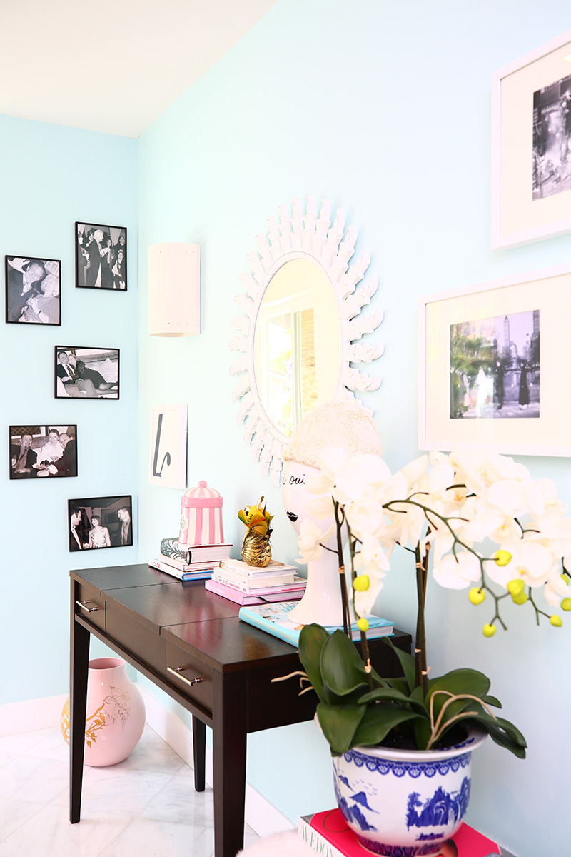
Also something to keep in mind: What color furniture and accessories are going to be in the hallway/area you’re decorating. In our case, we knew we wanted to use what we had: a black floor-length mirror, gold sconces, a dark brown vanity table and a white sconce.
You can click here to see all of the beautiful hues Curator Paints has to offer.
Step 3: Test Paint Colors!
Once we’d selected a few colors we liked, Fred Baby mocked them up in an architect program to see how they would look.
While it’s very easy to get caught up in the makeover excitement (#guilty) and want to just pick and color and go for it, I’ve learned that the best thing to do is to try out a few colors on your walls, and sit with them for a day or two, so you can see how they look IN your space in both daylight and at nighttime and with your things. It’s amazing how much lighting can affect a color.
That said, I will say that the Curator Paints are VERY true to color. Meaning, if you get one of their sample cards, that’s exactly how it dries on the walls. I LOVE that.
PAINT SAMPLE HACK:
I totally spaced and forgot that Curator has nice big sample swatches that you can just tape up to your walls, so we bought sample pots of each color instead. Instead of painting directly on the wall to color test, we just painted on printer paper, let them dry and taped them up.
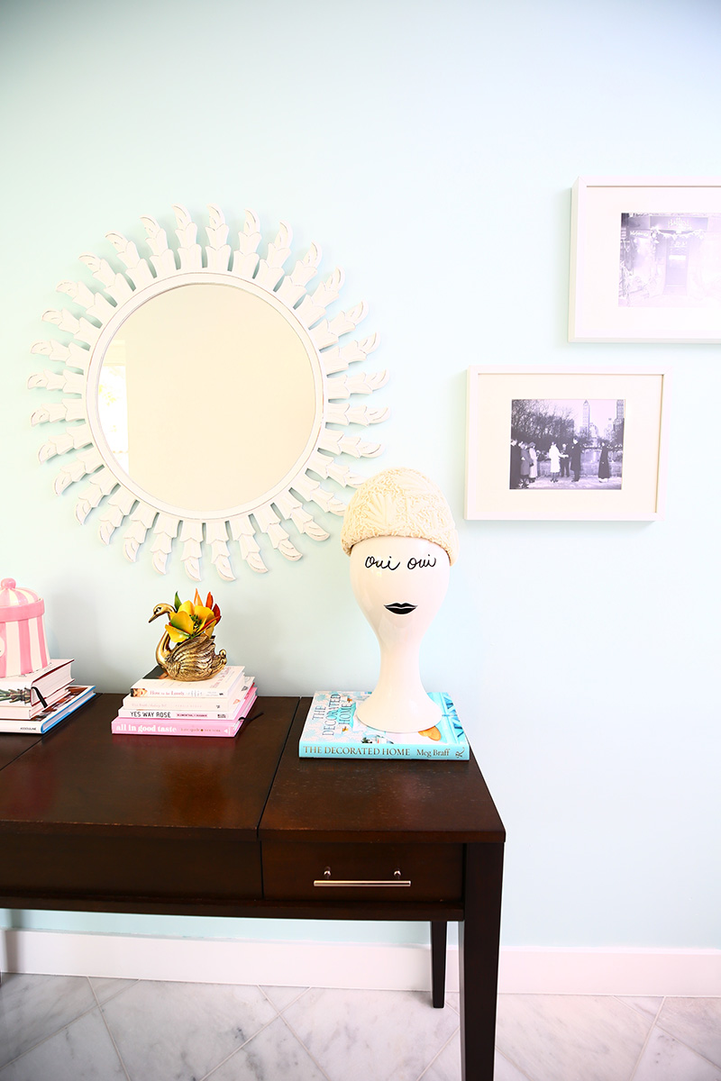
We ended up loving both colors, but ultimately went with the lighter blue called Thimble. We knew we wanted to hang black-and-white photos on the new blue wall and I’ve always loved Million Dollar Decorator Mary McDonald’s home office, so that sealed the deal for the softer blue.
Step 4: Prime + Paint
Once we made our final paint selections and picked up our Curator Paints at Dunn Edwards Palm Springs (see all locations here), we taped off the walls and then primed the walls. After letting that dry, it was time for the fun part: painting!
This part is SO satisfying because you see the real transformation occur right before your very eyes.
BOWCHICKAWOWOW!!!
We ended up with these three paint colors:
Stonechat
Isn’t that peach so warm, glowy and glamorous? I love it!
Thimble
So classic, light and lovely, like the sky. It reminds me of Breakfast at Tiffany’s or a fancy Upper East Side apartment.
Dancing Light
A bright dose of sunshine. When we showed my parents the stripes on Facetime, they thought it was wallpaper!
Step 5: Style It Up!
The final step in a hallway makeover is to style up the space with furniture, art and accessories. I love this part.
We had these black and white photos of our wedding and of friends, family and our travels in simple black frames that were collecting dust in our garage. They used to hang in our old apartment in San Francisco and we loved them. Obviously this past year has us missing traveling and seeing our friends and family, so we were SO excited to get these back up on our walls. Now when we walk down the hallway, we are surrounded by love and warm memories. I highly recommend it!
PRO TIP:
Printing photos in black and white helps unite photos visually and look so great grouped together.
As for the other art you see, we have lot of Fred Baby’s photography hanging on our walls, as well as a giant beach umbrella photo by our friend Gray Malin. At the end of the hallway is a favorite Breakfast at Tiffany’s print of Holly Golightly and Fred Baby. The blue frame ties back in to the newly painted blue hallway.
That’s a Wrap
Okay, now tell me…. What do you think? Do you like how it turned out? I hope so. We LOVE it! Amazing what a little paint can do for your home and your mood, right?!
It has totally re-energized the space and since home is more important than ever these days, we feel very lucky to have another space that really feels like us.
Do you have any home makeover projects in the work for the New Year? I’ve love to hear below.
As always, thank you so much for reading and weighing in with your thoughtful comments.
Happy 2021 xo!
Brought to you in partnership with Curator Paints. All thoughts and opinions are my own. Thank you for supporting our sponsors, who make the Golightly magic possible!
PHOTOS by FRED MOSER
SHOP MY LOOK
We’re launching a fun newsletter! Sign up for sunshine in your inbox
here:
related posts
The Kelly Golightly Collection Has...
Discover the debut Kelly Golightly Collection: vintage-inspired caftans and dresses designed in Palm Springs, handmade in Los Angeles, and created for glamorous getaways, soirées, and everyday elegance.
read moreI’m on the Cover of Locale M...
Best Restaurants in Palm Springs (...
From Old Hollywood classics to buzzy new favorites, this is my local guide to the best restaurants in Palm Springs—where I eat, sip, and send friends.
read more


I love it! Where did you get the Tiffany print? I just started working there and need something like this for my home. I love the colors you chose and am so grateful for this little piece of inspiration! Thank you again Kelly for making me feel something during this crazy time. Happy 2021 xoxo